
Digital Transitions, Gear Testing, Hardware, Phase One
Phase One Trichromatic: Part 1, the Science

Oct
Featured Image above by Carol Highsmith using the Phase One IQ3 100mp Trichromatic
Editor’s Note: This is the first part of a two-part article. Part 2 is here: Phase One Trichromatic: Part 2, The Results – What was improved, and how.
Foreword: About the Author, Doug Peterson of Digital Transitions

Image by Doug Peterson in the Pre-Trichromatic Era using a Contax 645 and Phase One IQ250.
I find myself at the intersection of three groups:
- R+D: PhD types who deeply understand the technicals but sometimes struggle to explain them to photographers
- Photographers: who care deeply about their tools, but may or may not care about the technical nitty-gritty of how they work
- Marketing folks: who are employed to communicate to [Photographers] about the cameras that [R+D] makes
As the Head of R+D at Digital Transitions, the largest Phase One partner in the world and the 2017 Phase One Partner of the Year, I speak with a lot of the engineers at Phase One R+D in the course of our various DT R+D projects (e.g. DT Capture One Style Pack, DT Film Scanning Kit, and DT Time Lapse Tools). As a photographer, I shoot weddings and fine art nudes using Phase One gear, as well as instruct some of DT’s classes and trainings. And for many years I was the head of marketing for two large Phase One Partners.
Being at the intersection of these three groups I’m often afforded the opportunity to observe them interacting. They speak three different languages and while they often communicate fluidly, sometimes there are significant misunderstandings or mistranslations. When I hear those miscommunications, I like to see if I can help translate.
The initial launch of the Phase One IQ3 100mp Trichromatic was one such instance where the communication between these three groups wasn’t perfect.
The Phase One IQ3 100mp Trichromatic takes a new and improved approach to color. But the explanation of that approach left many scratching their heads. Given the nature of the improvement I’m not at all surprised: color science is complex!
As the raw files in this article will show, the improvements made by the Phase One IQ3 100mp Trichromatic are real and show up in the images it produces. In this article I aim to explain the nature of these improvements, so our clients can judge whether they matter to their workflows and for their needs.
But first, a few words about what to expect from this article.
What This Article Will and Will Not Contain
If you came to this two-part article hoping for a PhD dissertation on color science you’ll be disappointed. I do not hold a PhD in color science, nor do many of our clients. If you’re hoping this article will contain precise 10nm-sliced spectral transmission curves generated by a monochromator, along with associated data tables, then you’ll be disappointed. Phase One is a for-profit company, not an academic institution, so publishing those curves would be giving away many man-years worth of accumulated experience. Personally, I won’t shed tears over either of these omissions; in my experience neither PhD dissertation nor highly detailed Spectral Transmission Data is of all that much value to a photographer deciding which equipment is the best fit to their needs and budget.
That said, a basic understanding of the science of the improvement does have value! This article covers those technical underpinnings of the sensor in a way that is accurate, but not needlessly complex. We’ve taken this approach in previous articles like the IQ260 Sensor Story published on Luminous Landscape and received positive feedback for it, so are repeating that approach here. This will include illustrations of spectral transmission that are meant as a learning aid; these are crudely drawn and exaggerate differences to make them easier to consume, and should not be taken literally, but for those not steeped in scientific measurements of spectral transmission they will help visualize relevant improvements.
In this article you will also find some background about the business and practical side of the development of the Trichromatic. Over the years I’ve found it can be useful to understand the business dynamics that influence R+D (e.g. which companies are targeting what parts of the market).
Importantly, at the end of Part 2 you will find direct raw file comparisons of the IQ3 100mp Trichromatic, which you can download and evaluate for yourself.
Lastly, this article will not answer whether you should purchase a Trichromatic. As a company DT doesn’t feel it’s our job to “sell” – but rather that it’s our job to provide the tools, information, and testing opportunities that our clients need to evaluate whether, what, and when to buy. This article and the raw files that accompany it, are part of our effort to do that for the Phase One IQ3 100MP Trichromatic; we also have open houses, road shows, personal demos, and evaluation units to aid our clients in that evaluation. Phase One is our passion, and if you’re considering renting or buying this back we hope you’ll provide us the pleasure of helping you.
But, before we talk about the Trichromatic, we need to talk about color. If you’re standing up, I’d suggest sitting. If you enjoy a whiskey, I’d suggest pouring one. Color is a doozy.
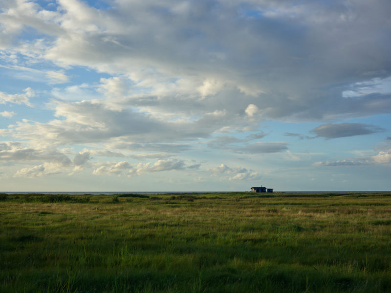
Image by Niels Knudsen on Phase One IQ3 100mp Trichromatic during development of the Trichromatic CFA and its hand-tuned color profile.
Color: Down the Rabbit (Black) Hole
With some subjects the more you learn the better you feel about your overall understanding. With other topics the more you learn the more you understand how much of the knowledge iceberg is still under the surface of your understanding. Consider physics. When you’re in grade school you learn that all matter is made up of fundamental particles with tidy orbits. Later you learn those particles aren’t fundamental, but rather made up of variously charged subatomic particles with funny names that do not orbit in pretty circles – in fact one can’t even tell where a particle is and where it is going simultaneously because of something about how much Austrian physicists hate cats. If you keep going, you learn there may be 11 dimensions, light is both a wave or a particle depending on who is asking, the universe may be a simulation, and 95% of the known-universe is “dark matter” – a scientific euphemism so banal scientists might as well have named it: ¯\_(ツ)_/¯.
Or at least that’s what my physicist friends tell me; I once tried to read a book about the General Theory of Relativity and ended up in the fetal position, slowly rocking back and forth. The point is, physics seems really simple until you dive in, but the more you learn the less you truly understand.
Color is like that. Maybe worse.
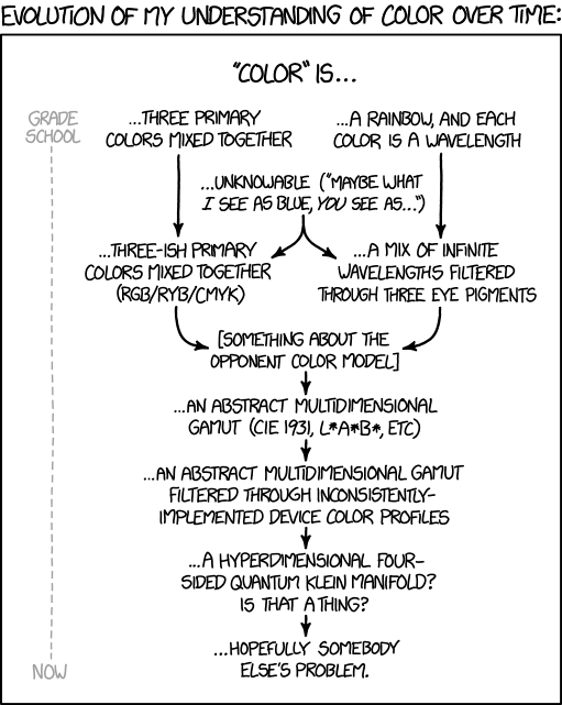
However complicated you think it is, you’re probably underestimating it. The below XKCD comic (source) sums it up pretty well:
Some Mostly-True Statements About Color
This article cannot provide a full Introduction to Color Science. But we can cover some ground that will become relevant with the improvements made by the Phase One Trichromatic.
“Color” is the End Result of a Long Chain
First, light falls on an object and part of that light is reflected by the object. Second, the reflected light enters the eye, and is translated into signals. Finally, the vision system interprets those signals and constructs an image in our head of a colored object. There’s a ton of interesting science in each of these steps (for example, dive into Wikipedia for Color Constancy or the History of Blue). But for the purposes of this article we’re concerned with the step where light hits a detector (the eye, or a digital sensor) and is turned into signals.
Visible light is a Sliver of the Electromagnetic (EM) Spectrum
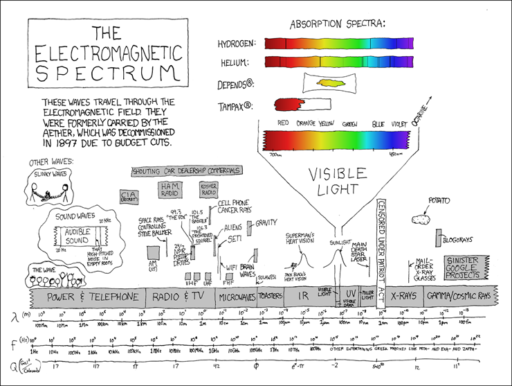
Human beings see the slice of the spectrum we call “visible light” because it’s especially useful for not dying. There’s plenty of it around (because the sun emits plenty of it, and a lot makes it through the atmosphere), and it’s the right scale to see things that we want to eat (e.g. apples) and see things that want to eat us (e.g. leopards). In contrast, if humans “saw” the part of the spectrum that we call “radio waves” we’d find the smallest visible thing was about a meter in size (it’s hard to eat an apple if you barely see the tree). If humans “saw” the X-ray part of the spectrum we’d be in the dark, literally – the sun puts out a lot of X-ray “light” but nearly all of it is absorbed by the Earth’s atmosphere so there’s hardly any around.
The “visible light” part of the EM Spectrum isn’t “special” in an absolute sense; it’s just another slice of a very large spectrum, but it is special to human beings since it’s the slice of the spectrum that our eyeballs respond to. Although there is slight variation from one person to the next we all see pretty much this same slice of the EM spectrum. If the human eye was sensitive to ultraviolet (UV) or infrared (IR) then we’d experience color differently. In fact, other animals do see parts of the spectrum that human beings don’t; for example, a bee can see UV, and flowers that have evolved to attract bees often have patterns that are only visible in UV.
Color is a Sensation, not a Physical Attribute
If a tree falls in the forest and no one is around to see it, it does not have a color. Color is an experience of the viewer. “Color” cannot be “measured” in the same direct and visceral way that we can measure mass or length. The actual physical attribute associated with the sensation of color that can be measured is the spectral content of the light that makes it to the eye; “color” is just how our eye and the human vision system translate that continuous spectral content into a simpler attribute.
It’s theoretically possible that human beings could have developed a vision system wherein the internal manifestation of the way a thing “looked” was a direct representation of the spectrum itself. In fact, we developed that style of “sense” in the facility of hearing. A talented musician can listen to a chord (which is many notes played at the same time) and identify (“hear”) each individual note, as well as appreciate the overall character of the chord; the musician can hear the parts as well as the sum of the sound. But with human vision we do not see the spectrum reflecting off an object, we see a simplification of that spectrum into an overall impression of the spectrum that we refer to as “color.” We only see the sum of the light, not the parts.
The eye does this by having three different kinds of detectors. It can be very loosely said that these three detectors are sensitive to the parts of the spectrum we call “red,” “green,” and “blue.” This reduces a spectrum with an infinitely complex shape to just three signals: the amount of red, the amount of green, and the amount of blue. The human brain then mixes those three signals together to produce a single value: the color. You may intellectually know that a purple object contains both “red and blue” but the color your brain constructs, the color you experience, is purple.
Doing it Digitally
To recap all of the above for good measure:
- The sun (or “light bulbs” etc.) emits a wide spectrum of electromagnetic radiation.
- When this radiation hits an object, part of it is reflected and enters the eye.
- The eye is sensitive to the radiation of a narrow slice of the spectrum we call “visible light.”
- There are three kinds of detectors in the eye, each sensitive to a different part of “visible light,” so three signals are generated.
- The brain combines these three signals to create the sensation of a color. Needless to say there are a lot of asterisks, caveats, and “not quite”s that could be said of the above (the rabbit hole just keeps going), but if you managed to get through the above without a headache you now basically understand the journey from [object] > [eye] > [color].
To “see color” a digital camera sensor must record three signals. By far the most common method is to place a grid of three color filters in front of the sensor so that each pixel sees either red or green or blue. This grid is called a “Color Filter Array” or CFA. In 1976 a guy named Bryce Bayer, while working at Kodak, patented a specific CFA arrangement which is used in 99.9+% of cameras sold – the eponymous “Bayer Pattern.”
Of course exactly what light the “red,” “green,” and “blue” pixels or eye respond to is a point of great importance. As a crude approximation consider the “red, green, blue overlapping light” project from photo school. In this project three strobes are set up, the first covered by a green gel filter, another with a red gel filter, and the third with a blue gel filter. When those three lights are pointed such that they overlap they are meant to produce “white” light. But as anyone who has done this knows the end result is a weird neutral-ish white-ish light that sort of renders color in the subject in a “not quite right” way. The reason being that a random red, green, or blue gel filter is very unlikely to let through exactly the right amount of each sliver of the visible spectrum (light with the right “spectral transmissive curve”) such that adding them together results in a smooth and sun-like light.
The same is true of the CFA: the exact nature of the red, green, and blue matter – a lot. Here’s an example of a traditional CFA:
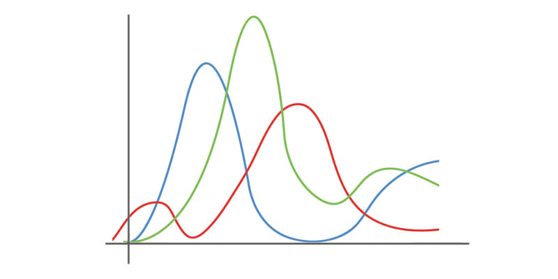
And another one showing the response of the eye’s three detectors:
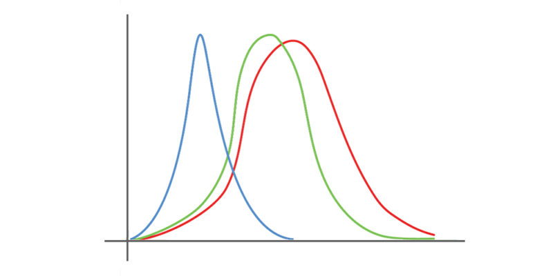
The most obvious difference is actually relatively unimportant; the “green” and “red” overlap a lot more in the eye than on the sensor, but for fancy mathematical reasons that’s not just okay, it’s desirable. The more subtle differences are what Phase One has improved, and will be detailed later in this article.
No commercial photographic camera sees color in exactly the same way as the human eye, including the Trichromatic. But, by leveraging unprecedented experience, a large R+D investment, and a great relationship with Sony, Phase One has been able to bring photographers closer than ever before.
The story of this improvement, the story of the Trichromatic, as is often the case of science-meets-business, is as much a story of the people involved as it is a story about the science itself. Enter two men: my grandfather, and Niels Knudsen (“Phase One Image Professor”).
Lessons From “Gramps”

My grandfather, many years after retirement.
My grandfather worked as a blue collar “color scientist” in a porcelain factory in Ohio. He was ultimately in charge of making sure the client was happy with the color of custom orders. He would receive fairly quirky orders on a shockingly frequent basis. For example one gentleman wanted to commission a bathtub to match the color and curve of a vase he had acquired overseas. My grandfather didn’t know scientific color science terms like “Color Opponency” or “Tristimulus Response” or “Metamerism” but after years on the job he developed a keen understanding of the complexities of color.
For example he knew:
- Two objects could match color in one light (e.g. daylight streaming through the window) but not match under another (e.g. the incandescent lights of a customer’s bathroom). That is what color scientists would call metameric error.
- Photos taken with a customer’s walk-around camera weren’t necessarily a great way of determining the color of an object; color photography only became prevalent in the latter part of his career, but as he said “it hurt as much as it helped.”
- Three dimensional objets were trickier than flat color patches. Glazing, texture, shape, viewing environment, and even the age and mood of the viewer, could drastically affect how his customers perceived the color of his factory’s output.
The issues my grandfather struggled with highlight an important element of applied color science: it is a lot messier than theory. To be a real master of color you need experience with both the theory and the practice of color. With years of experience my grandfather became a field expert in porcelain color, able to nail the production of a color by adding a pinch of this, a smidgen of that, and running the oven a little hot.
My grandfather didn’t care much for the few color science academics he met. He respected field results more than theories.
He would have loved Niels Knudsen.
Niels Knudsen: My Grandpa with a Lab Jacket
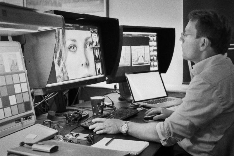
Niels Knudsen at work creating a hand-tuned color profile for a camera. One assumes the use of black and white is meant to be ironic here.
Niels is a lot like my grandfather, if you added a lab jacket, glasses, and the ability to calculate color matrix transformations by hand. He has an education in color science and extensive technical chops, but he also has something few others have: decades of experience in the messy real world practice of color science for real-world cameras.
Niels has been with Phase One since Day 1 and has been the Chef and the King’s Taster for “color” at Phase One for almost as long (in this analogy, the customer is the “King” and color does not reach the customer unless Niels has personally approved it). This has earned him the title “Image Professor” around Phase One’s Copenhagen headquarters.
Phase One produces its own medium-format cameras, but also crafts Capture One Pro software, which supports hundreds of small-format cameras from Canon, Nikon, Sony, Fuji, Pentax, Leica, and more. While many raw processors simply take the color profile provided by the manufacturer, the Capture One team insists on building their own profiles by taking real-world photos with an actual camera. That means for all of the hundreds of cameras Capture One has supported over the years Niels Knudsen has sat at a monitor and examined the raw data coming off of that camera’s sensor (from real-world scenes) and helped shape, tuck, squeeze, and hammer the best possible color from it.
If the theory of “10,000 hours of deliberate practice makes a world-class master” holds true then Niels is an expert on color profiling many times over.
Great Repairmen Make Great Engineers
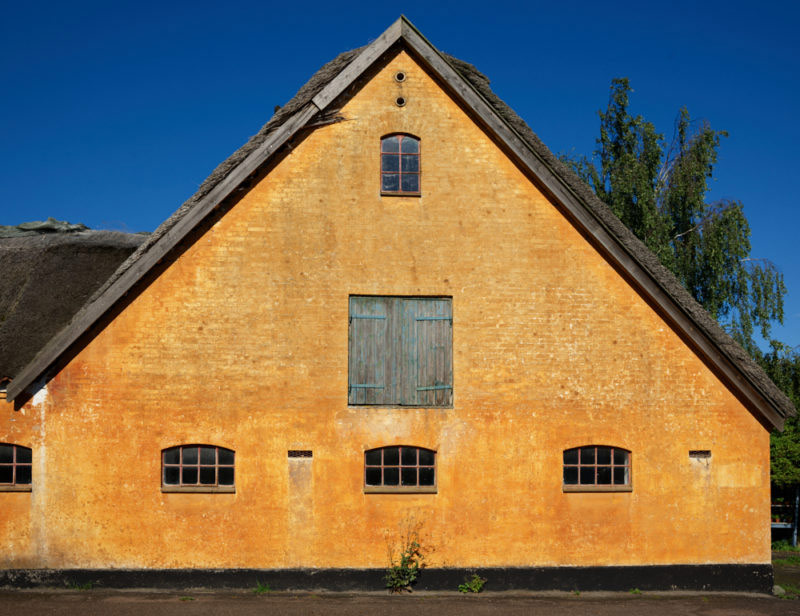
Image by Niels Knudsen on Phase One IQ3 100mp Trichromatic during development of the Trichromatic CFA and its hand-tuned color profile.
Profiling cameras over and over again certainly improves one’s skill of camera profiling, but it also provides something very few people in the world have: an understanding of what camera attributes lead to accurate color in the end. That is, how does a given lens, infrared filter, color filter array, and sensor impact a camera’s real-world images once an expert has hand crafted a color profile for it. Not on paper, not as a mathematical theory, not as a lab study, but in the real world.
What helps make a camera, once profiled, that produces pure blue skies, beautiful skin tones, and lively organic green foliage? What helps make a camera, once profiled, better able to pick up that weird shade of eggplant purple, bark brown, or dandelion yellow? These are questions better answered by hands-on experience than theory. Color profiling is an art of compromise. Some color issues can be easily improved with a (very good) profile, while others are intractable; some matter a lot in the real world and others don’t matter much outside a lab.
Imagine Joe the Automotive Repairman who spends his life learning how to perfectly tune the performance of hundreds of models of cars. That experience helps him gain real-world knowledge of what design attributes and engine specifications help create a car that, once tuned up perfectly, leads to the best real-world driving experience. Niels is that, but for camera color.
The Drive for The Best

A 100% pixel crop of the Yellow House above. Subtle colors are all around us. Helping to make cameras that capture them is Niels’ passion.
After years of tucking, squeezing, and hammering color out of sensors, Niels advocated that Phase One should pioneer a new sensor filter design that would address the shortcomings he saw again and again in profiling cameras from third parties. It’s not that the color out of current cameras was bad; indeed any Phase One user knows state of the art color prior to the Trichromatic was already very good. But Niels saw specific areas for improvement; his advocacy was that a lot of time and money should be spent to improve “very good” to “even better.”
It’s fortunate for Niels that he works at Phase One. Most camera companies must keep their eye on a very broad market, and must be very mindful to keep R+D focused on those areas that will expand sales among the bulk of the camera market. For most camera consumers reducing the weight of a camera by 50 grams or the cost by $50 is of more consequence than an improvement to the color rendering of difficult subject matter. But Phase One doesn’t make pocket cameras, or budget cameras, or cameras with Instagram filters or ISO one billion; their market cares a lot about color and image quality and as a result Phase One is fanatical about making sure their cameras define the bleeding edge of image quality. A great way to get a room of Phase One R+D engineers buzzing is to show them an area of image quality that can be improved, even if the difference is only in some cases. So when Niels proposed spending considerable time and money on a project that would only modestly improve color in most scenes, he was met with eager approval. In the words of the CEO Henrik Håkonsson: “It is a core belief at Phase One that if we can improve the image quality of our cameras it is worth almost any price to do so. Quality, quality, and quality are our top three priorities.”
It’s also fortunate for Niels (and Phase One users) that Phase One has a very close relationship with Sony, because it’s not enough to design a new CFA. An idea on a cocktail napkin is fine for debate over a glass of wine, but ultimately someone has to agree to make it, and there are only a few fabrication centers in the world with the technical capability required; one of those belongs to Sony. Phase One is not one of Sony’s largest customers; in fact they are one of its smallest. But, as any Sony shooter know, Sony has been cozying up to Phase One for several years now. Every high-end Sony ships with a copy of Phase One’s Capture One software. Every new medium-format sensor that Sony has shipped has first been shipped in a Phase One camera, and on a personal level Phase One and Sony engineers have been getting along famously. Says Lau Nørgaard, Phase One’s Head of R+D: “Our (Sony and Phase One’s) teams just work well together; there’s a lot of mutual respect in the shared goal of pushing the boundaries of image quality.” In this case, the result of this mutual respect and close business relationship is the collaboration that produced the Trichromatic.
So What? Show me some proof!

Image by Carol Highsmith using the Phase One IQ3 100mp Trichromatic
So what was it that Phase One did? What are the specific improvements made, and how do they manifest in real real images? For the answers, and raw file comparisons to traditional CFA cameras, read Part 2, The Results: What Was Improved, and How.